

In today's digital world, having a website or online presence is no longer enough. It's important to ensure that your website is optimized for both search engines and user experience. One of the most critical elements of any website is the call-to-action (CTA). A well-designed CTA can make all the difference in encouraging visitors to take action and convert. But what makes a CTA effective? The answer lies in the science of CTA design, which involves a careful balance between persuasive copy, color psychology, and placement. Moreover, the design of your CTA can also impact your website's search engine optimization (SEO), affecting your website's visibility and ranking on search engines. In this article, we'll dive into the science of effective CTA design, exploring key principles and strategies to help you improve your website's conversions, user experience, and SEO.
A call-to-action (CTA) is a button or link that prompts users to take a specific action on your website. Examples of CTAs include "Sign Up," "Learn More," "Download Now," and "Add to Cart." CTAs can be found on landing pages, product pages, blog posts, and other areas of your website. It serves as a catalyst for conversion, helping to move prospects further along the customer journey and ultimately towards a desired goal, such as making a purchase, subscribing to a newsletter, filling out a form, downloading content, or requesting a consultation.
CTAs can vary in design, color, and copy. In order for a CTA to be effective, it must be visible, easy to understand, and placed strategically on your website. It should be concise, persuasive, and action-oriented, creating a sense of urgency or value to encourage immediate action. A well-designed CTA can increase the chances of users taking the desired action, while a poorly-designed CTA can lead to confusion and a lost sales opportunity.
CTAs are not only crucial for encouraging conversions, but they can also impact your website's search engine optimization (SEO). Search engines like Google take into account user experience when ranking websites. A website with clear, well-designed CTAs is more likely to engage users and keep them on their website. This signals to search engines that the content is relevant and valuable and can positively impact user engagement metrics, like dwell time, which can indirectly influence search engine rankings.
CTAs often involve internal links, directing users to relevant pages within the website. By strategically placing CTAs throughout the content and linking to other pages, you enhance the website's internal linking structure. This helps search engine crawlers discover and index important pages, improves website navigation, and distributes link authority throughout the site.
Moreover, the design of your CTA can also affect your website's bounce rate, which is the percentage of users who leave your website after visiting only one page. A compelling CTA can motivate visitors to take action rather than immediately leaving the website. This can contribute to lower bounce rates, indicating to search engines that users find the content engaging and relevant.

Effective CTA design involves understanding the psychology behind user behavior and decision-making. By tapping into user psychology, you can create CTAs that are more persuasive and engaging, increasing the chances of users taking action.
One key psychological principle to consider when designing CTAs is the concept of cognitive fluency. Cognitive fluency refers to the ease with which our brains can process information. When presented with information that is easy to understand and process, we are more likely to find it appealing and persuasive.
This is why clear, concise copy and simple design elements are so important for effective CTAs. Users should immediately know what action they are expected to take. By presenting a straightforward and simple CTA, you reduce cognitive load and make it easier for users to make a decision.
CTAs should use action verbs to prompt users to act. Words like "Shop," "Join," "Subscribe," "Download," or "Start" convey a sense of action and motivate users to take the desired step. Similarly, framing the CTA in a positive and optimistic tone can create a more favorable response. Using words like "Discover," "Gain," "Enjoy," or "Unlock" can evoke positive emotions and make the action seem more appealing.
Creating a sense of urgency or scarcity can also be effective in motivating users to take immediate action. Phrases like "Limited time offer," "Act now," or "Only X left" tap into people's fear of missing out and encourage prompt engagement.
Another psychological principle to consider is the concept of social proof. Social proof refers to the idea that people are more likely to take action when they see others doing the same. By including social proof elements in your CTAs, such as customer reviews, testimonials, or statistics that demonstrate popularity or positive experiences you can increase their persuasiveness and encourage more conversions.
Effective CTA design involves a careful balance of design elements that work together to create a compelling and persuasive visual. Canva is a graphic design tool that offers a wide range of templates and design elements for creating eye-catching CTAs. Some key design elements to consider when designing CTAs include:
Color is a powerful tool in CTA design, as different colors can evoke different emotions and associations. For example, red is often associated with urgency, while blue is associated with trust and security. When choosing colors for your CTAs, consider the emotions and associations you want to evoke, as well as your brand's color palette.
Contrast can make your CTA stand out and be more visible. It should complement the overall color scheme of the webpage while still creating a distinct visual contrast. Consider using contrasting colors or adding a border around your CTA to make it more attention-grabbing.
The size of your CTA can also impact its effectiveness. A larger CTA may be more visible and attention-grabbing, but it can also be overwhelming if it's too big. On the other hand, a smaller CTA may blend in too much with the rest of your website. Finding the right balance between size and visibility is key.
The shape of a CTA button should indicate its clickability and interactivity to users. Pay attention to button design elements. Use rounded corners or shadows to give the button a tactile appearance and help users recognize it as something they can click or tap. Incorporate visual cues, such as arrows or hover effects, to indicate interactivity and reinforce the clickable nature of the button. These cues can subtly draw the eye and indicate the desired action, improving the chances of engagement.
Use legible and clear typography for the CTA text. Choose a font style and size that are easy to read, even at smaller sizes or on mobile devices. Ensure there is enough contrast between the text and the background to enhance readability.
Surround the CTA with ample whitespace to give it breathing space and make it visually distinct. Minimize distractions around the CTA to keep the focus on the desired action. Avoid clutter or competing elements that can divert users' attention away from the CTA.
Implementing these design elements can create CTAs that are visually appealing, attention-grabbing, and optimized for user engagement and conversion. But it is important to ensure that it aligns with the overall branding and design aesthetics of the website or marketing materials to strengthen the brand identity and foster recognition.
In addition to design elements, the placement of your CTA is also critical for its effectiveness. This placement can vary depending on your specific website, target audience, and goals. Some best practices for CTA placement include:
Place the CTA strategically in a prominent location on your website, typically above the fold (visible without scrolling), meaning they should be visible without requiring users to scroll down the page. This ensures that the CTA is immediately visible to visitors when they land on the page, increasing the likelihood of engagement. Besides placing it above the fold, consider additional strategic placements throughout the page. For longer pages, you can include CTAs at multiple scroll points to provide users with opportunities to engage at different stages of their browsing experience.
Eye-Level Placement: Position the CTA at eye level, typically in the center or slightly to the right of the page, where users' eyes naturally focus. This placement capitalizes on users' reading patterns and visual scanning behavior, making the CTA more noticeable.
Align the CTA placement with the relevant content or context on the webpage such as product descriptions, blog post or testimonial. This positioning allows users to naturally encounter the CTA while consuming related content. If the CTA relates to a specific section or piece of information, position it near that content to reinforce its relevance and increase its persuasiveness.
Employ exit intent pop-ups to display CTAs when users show signs of leaving the page. These pop-ups can offer last-minute incentives, discounts, or valuable content to persuade users to reconsider their decision and take the desired action.
A/B testing is a process of testing two versions of a design element, such as a CTA, to determine which one is more effective. By testing your CTAs, you can identify which design elements, copy, and placement are most effective for your website and audience. Some tips for A/B testing your CTAs include:
Clearly define the goal of your CTA design element testing. Determine the specific metric you want to improve, such as click-through rate, conversion rate, or engagement rate, by focusing on the impact of design elements on user behavior.
Identify the design elements you want to test in your CTAs. These variables can include button color, typography, size, shape, placement, visual cues, whitespace, or any other design-related aspect you believe may impact user engagement. Test one design variable at a time to ensure accurate analysis. This will allow you to identify the specific element that is impacting its effectiveness.
Create different versions of your CTA, each with a single design element changed. For example, if you're testing button color, create two versions of your CTA—one with the original color and another with a different color. Randomly display each variation to different users to eliminate bias.
Split your website traffic evenly between the different design variations of the CTA. Utilize A/B testing tools such as Google Optimize or platforms that allow you to distribute the traffic and accurately measure the performance of each design variation.
Allow sufficient time for your A/B test to run until you achieve statistical significance. This ensures that the data you collect is reliable and representative. Statistical significance helps determine whether the observed differences in performance between design variations are statistically meaningful or due to chance. Compare the performance of each design variation against the baseline or control version of your CTA. Identify which design element performs better and positively impacts your defined goal. Consider primary metrics, secondary metrics, and any user behavior patterns that emerge. Once you have determined the winning design variation based on the test results, implement it as your new default CTA design but continue to test and optimize other design elements to further improve your CTA's effectiveness. Constantly refine and iterate your CTAs based on user feedback, evolving goals, and emerging design trends.
Effective CTA design is a critical component of any website's success, impacting both user experience and SEO. By understanding the psychology of CTAs, incorporating effective design elements, and testing your CTAs, you can create compelling and persuasive CTAs that encourage users to take action and ultimately improve your website's conversions and visibility on search engines.
Following up on my earlier post about BigCommerce's rebrand announcement, I got my hands on theCleveland...
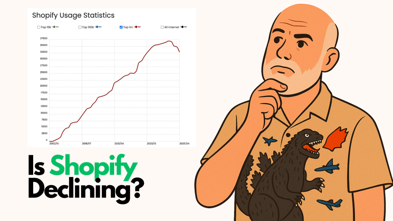
By Brent W Peterson AI vs Shopify: Is Platform Dominance Ending in 2025?

The B2B OG Reality Check In 1995, I built my first B2B website for my then computer assembly company. It...
